Crypto Application UI Redesign
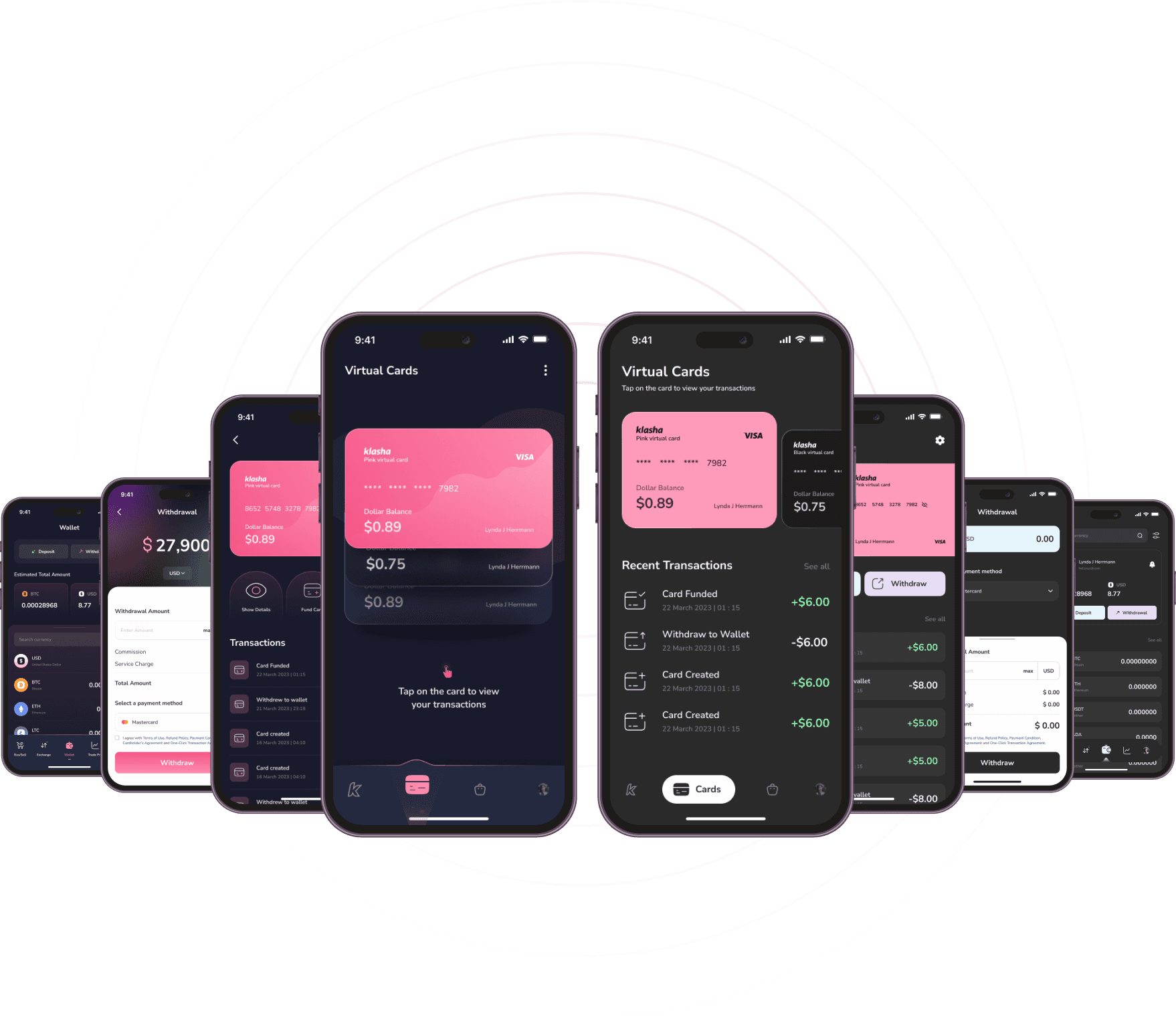
This cryptocurrency mobile application UI redesign focused on enhancing usability, readability, and visual appeal. By implementing a cohesive color palette, modern typeface, consistent iconography, and a structured grid system, the redesign delivers an engaging and user-friendly experience tailored to the dynamic needs of the crypto market.
Client
Crowd Design
Service Provided
Ui Redesign

The Goal:
The primary objective was to revamp a cryptocurrency mobile application’s user interface to enhance visual appeal, usability, and user engagement. This involved selecting an appropriate typeface, establishing a cohesive color palette, refining iconography, and implementing a structured grid system to create a seamless and intuitive user experience.
1

The Challenge:
The existing application faced several design challenges:
Typography: Selecting a modern, readable typeface suitable for the crypto market.
Color Palette: Developing a cohesive color scheme that maintains brand consistency while enhancing usability.
Iconography: Ensuring consistency in style and stroke weight across all icons to maintain a cohesive visual language.
Grid System: Implementing a structured and responsive design to ensure alignment and scalability across various devices and screen sizes. Additionally, specific screens required targeted improvements
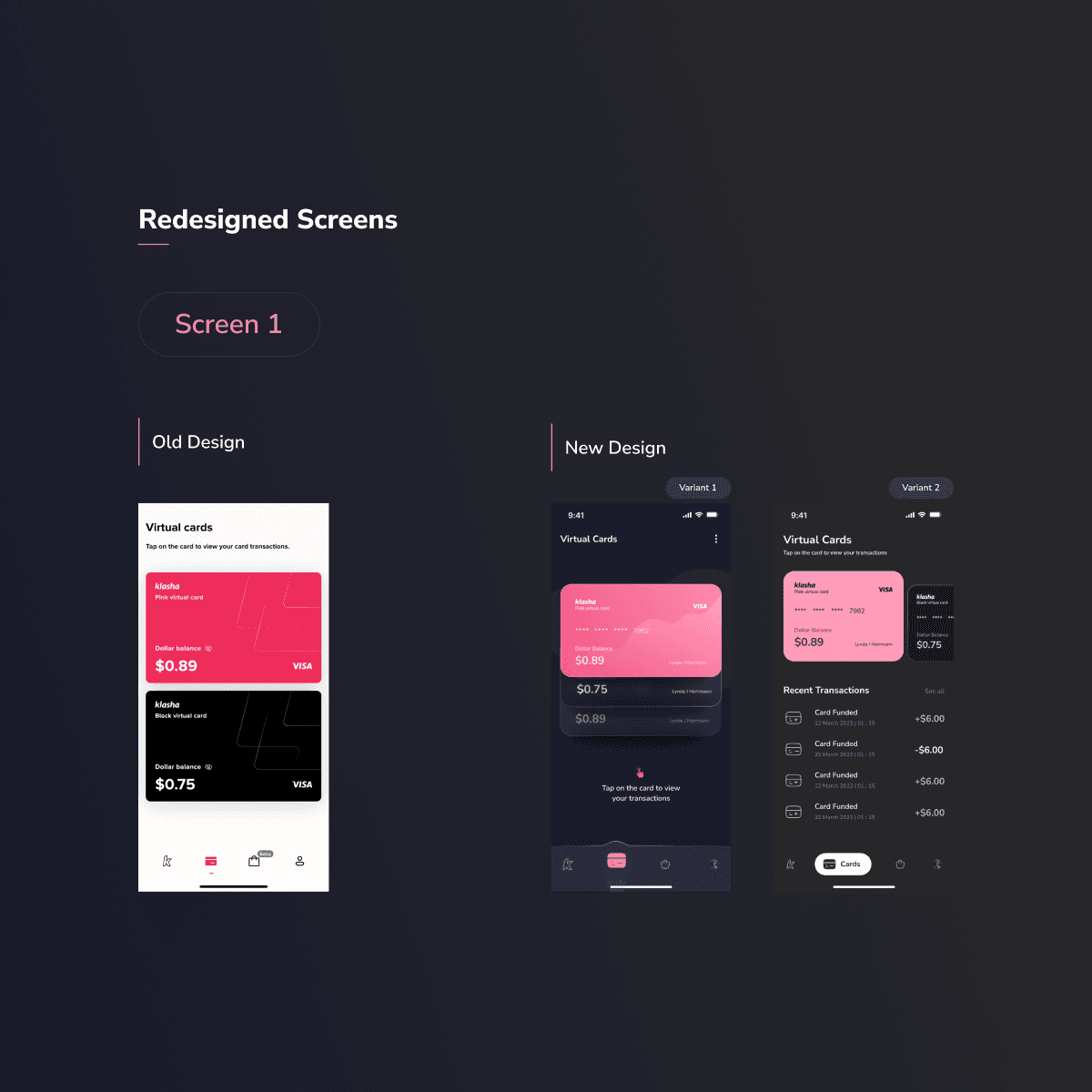
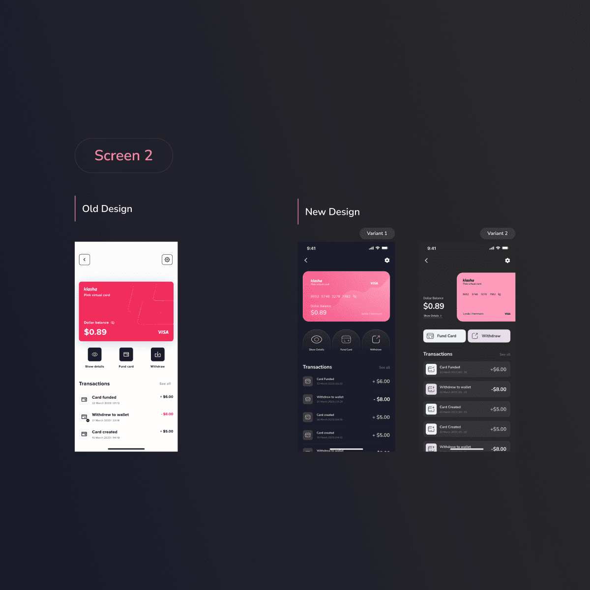
Card Redesign: Enhancing hierarchy and readability of cryptocurrency information.
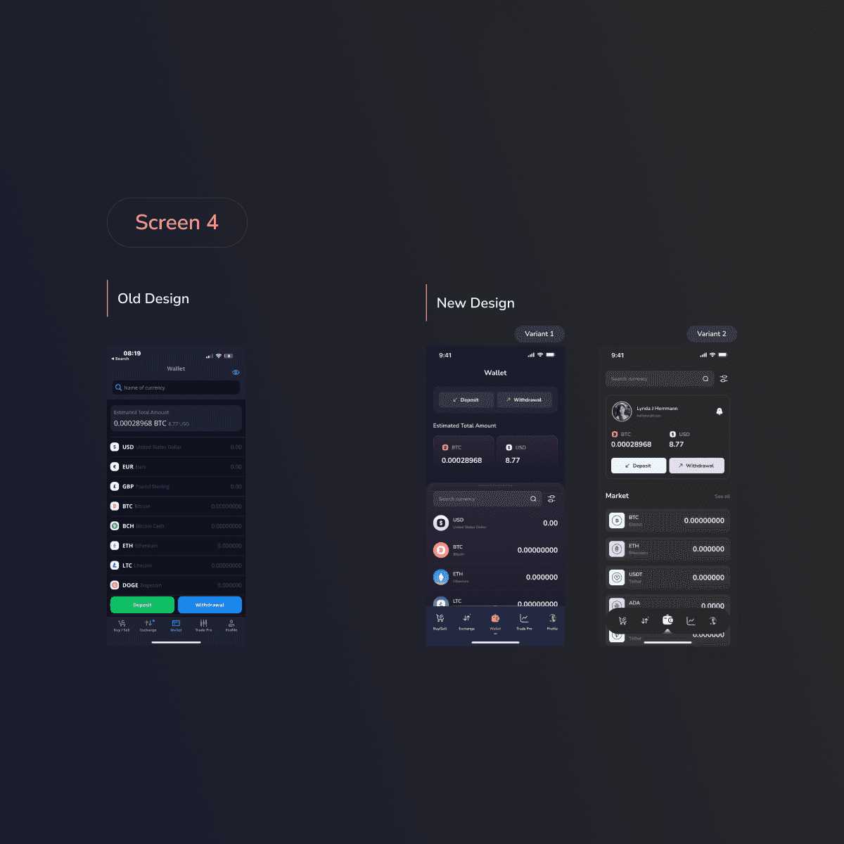
Dashboard Screen: Streamlining the presentation of key metrics and data visualizations.
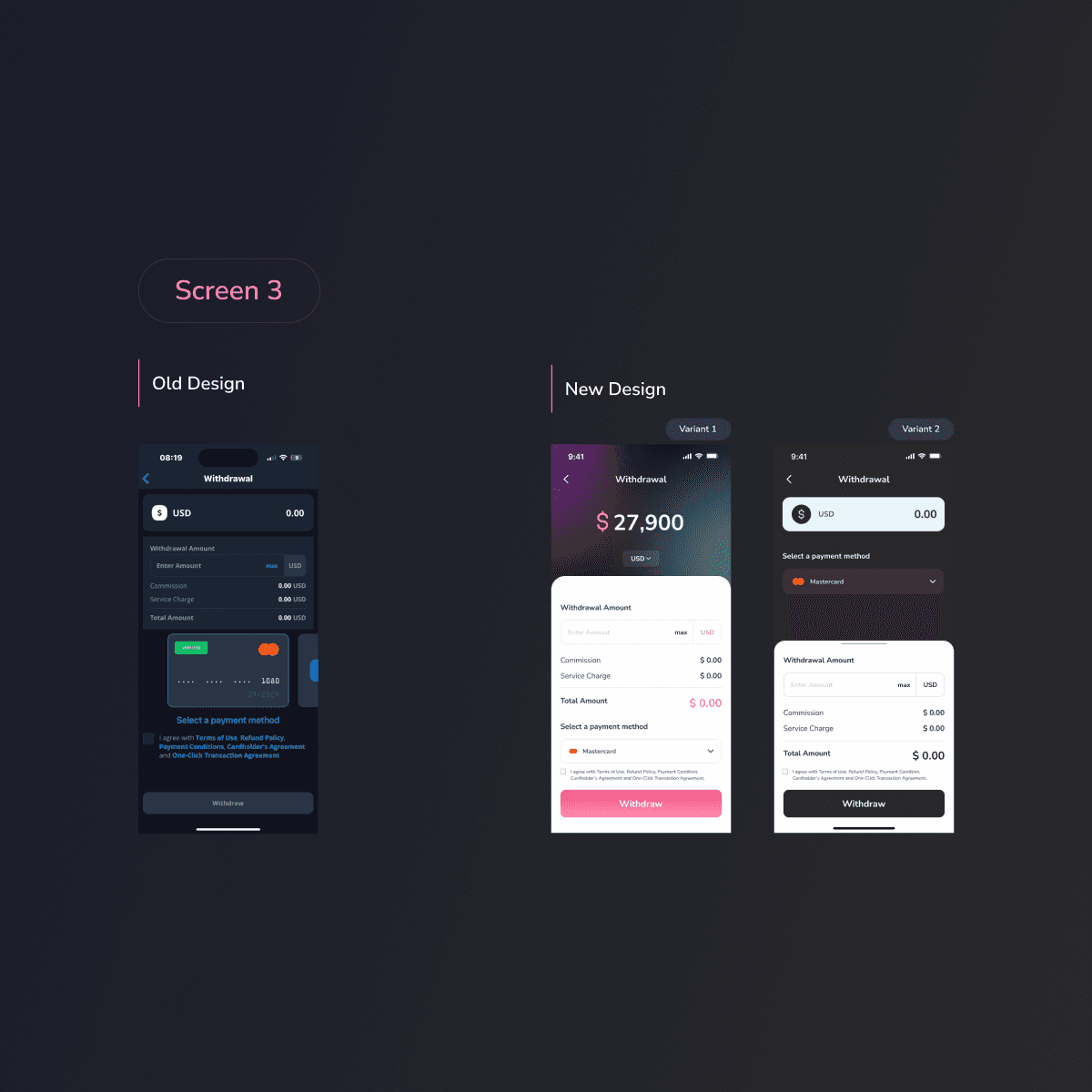
Transaction Screen: Simplifying the transaction process and providing clear instructions.
Profile Management Screen: Redesigning the layout for easy access and incorporating security features.
2
The Result
The redesign led to a more engaging and user-friendly experience tailored to the dynamic needs of the crypto market. Key outcomes included:
Typography: Adoption of Nunito Sans for its readability and versatility.
Color Palette: Use of pink shades, navy blue, and white to reflect the brand’s identity and enhance usability.
Iconography: Implementation of filled icons for primary actions and linear icons for secondary actions, ensuring visual consistency.
Grid System: Establishment of an 8-column grid with appropriate margins and gutters for a balanced layout.
The redesigned screens improved user interaction by providing clearer information hierarchy, streamlined processes, and enhanced security features.
3

Recent Designs