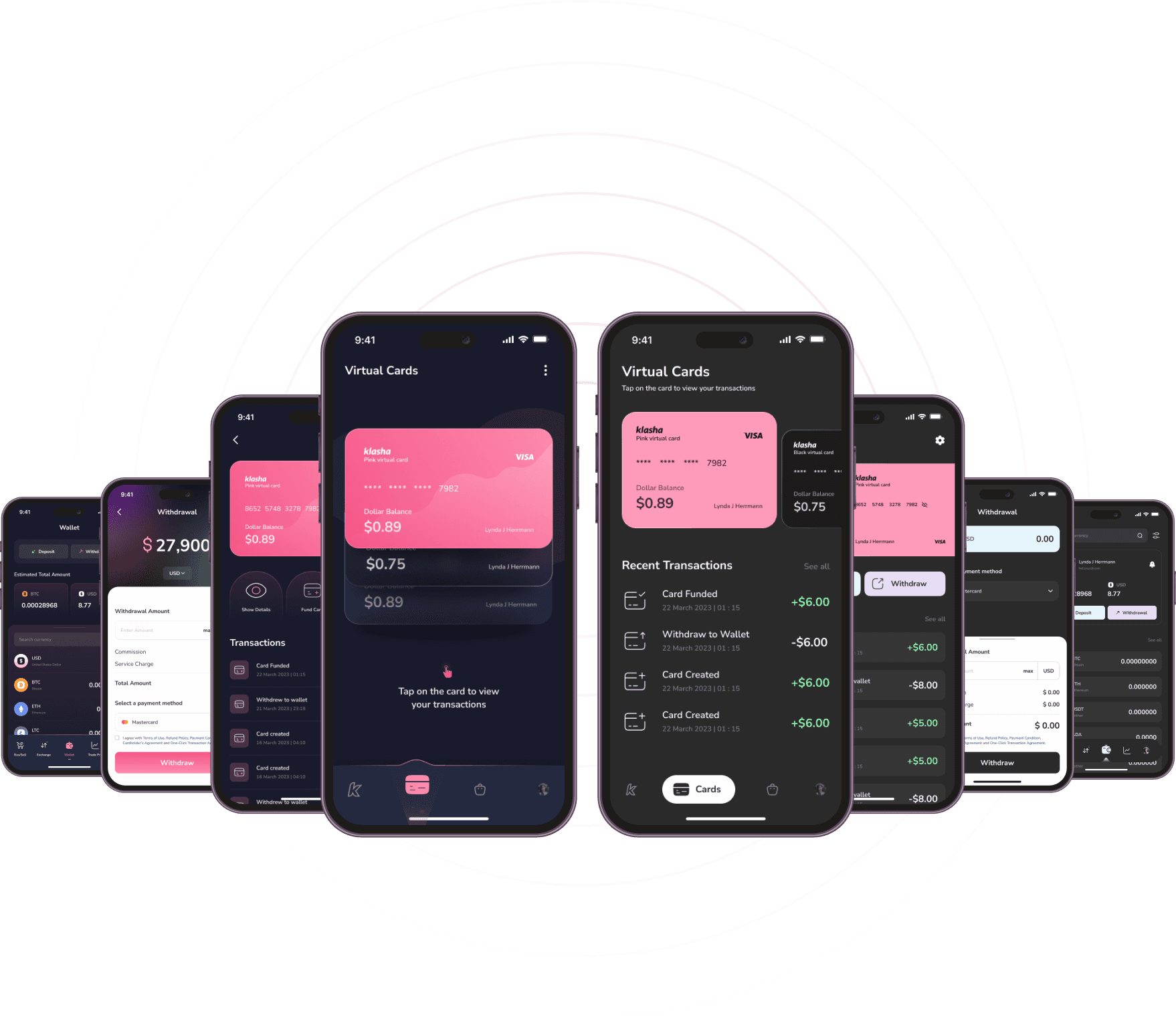
This cryptocurrency mobile application UI redesign focused on enhancing usability, readability, and visual appeal. By implementing a cohesive color palette, modern typeface, consistent iconography, and a structured grid system, the redesign delivers an engaging and user-friendly experience tailored to the dynamic needs of the crypto market.
Client:
N/A
My Role:
Ui Designer, Ux Researcher
Year:
2023
Service Provided:
Ui Design, Ux Research report
Project Overview
The objective of this project was to revamp a cryptocurrency mobile application’s user interface to enhance visual appeal, usability, and user engagement. The redesign focused on selecting an appropriate typeface, establishing a cohesive color palette, refining iconography, and implementing a structured grid system to create a seamless and intuitive user experience.
Design Elements
Typeface Selection
Chosen Font: Nunito Sans
Rationale: Given the application’s focus on the crypto market, a Sans-Serif font was deemed suitable for its modern and clean appearance. After experimenting with various options, Nunito Sans was selected for its readability and versatility across different weights and sizes, ensuring clarity and consistency throughout the application.
Color Palette
Primary Colors:
Pink Shades: Incorporated to align with the dominant color observed in the original application screenshots, maintaining brand consistency.
Navy Blue: Utilized for backgrounds to provide a professional and calming effect, enhancing focus on foreground elements.
White: Employed as an accent color to create contrast, improve readability, and contribute to a clean aesthetic.
Objective: The selected color palette aims to reflect the brand’s identity while enhancing usability and providing a visually pleasing experience for users.
Iconography
Styles Implemented:
Filled Icons: Used for primary actions to draw user attention and indicate importance.
Linear Icons: Applied to secondary actions, offering a minimalist and unobtrusive visual cue.
Consistency: Ensured uniformity in style and stroke weight across all icons to maintain a cohesive visual language throughout the application.
Grid System
Specifications:
Columns: 8-column grid structure.
Margins: 20px margins to provide adequate spacing and prevent content from feeling cramped.
Gutter Width: 8px gutters to ensure consistent spacing between elements, facilitating a balanced and organized layout.
Purpose: The grid system was implemented to create a structured and responsive design, ensuring alignment and scalability across various devices and screen sizes.
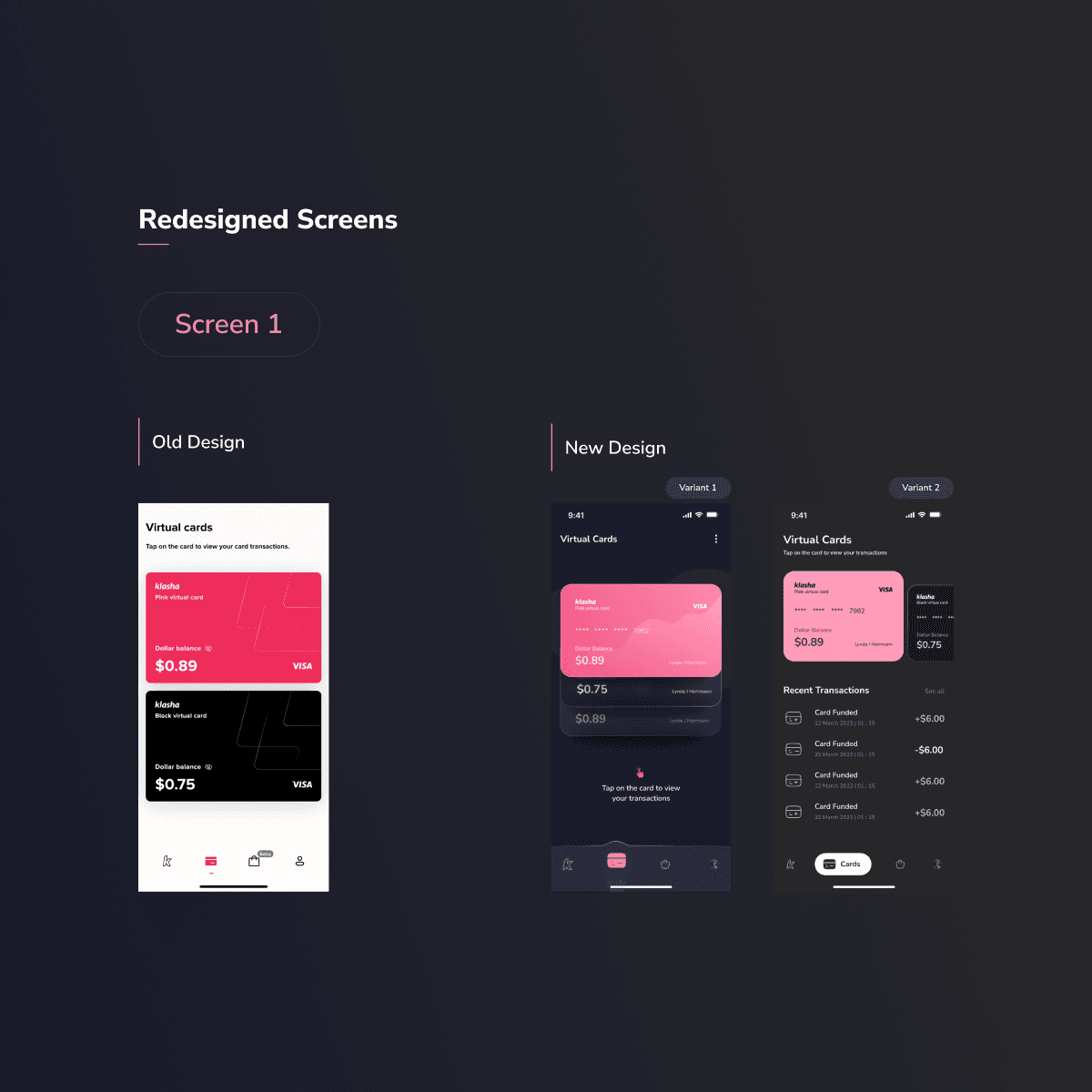
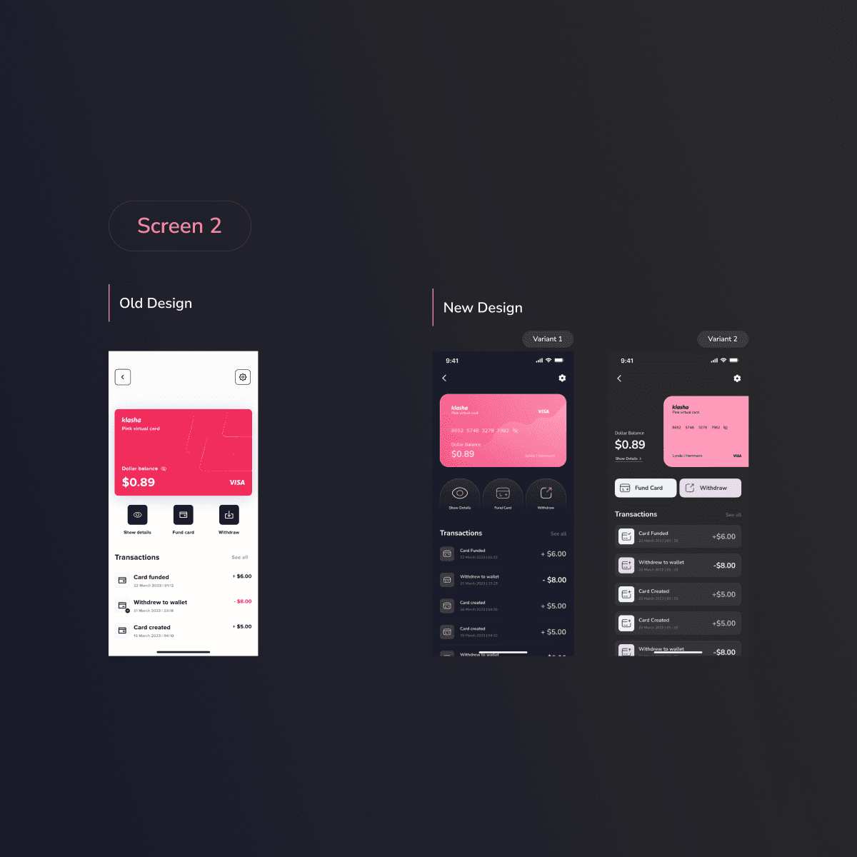
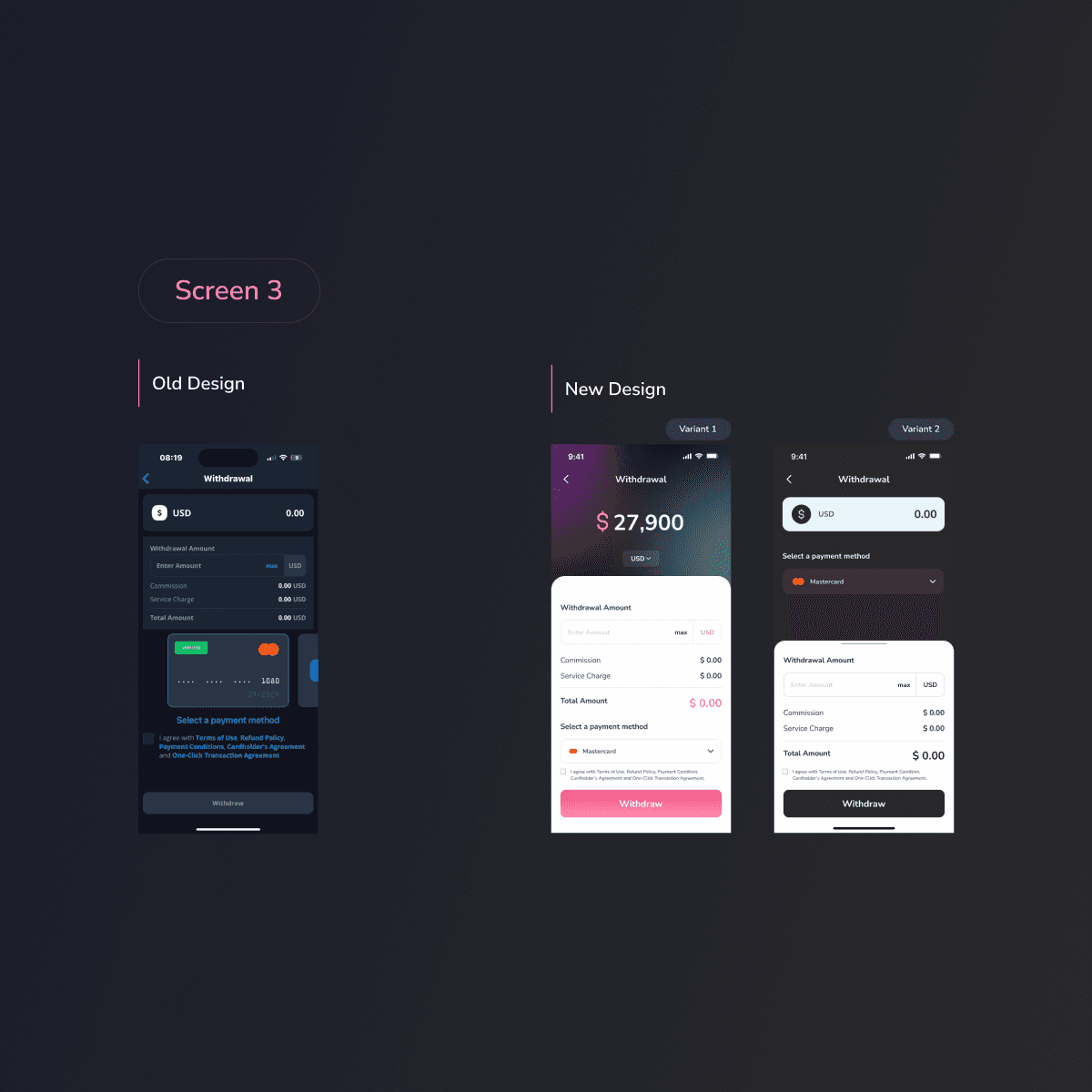
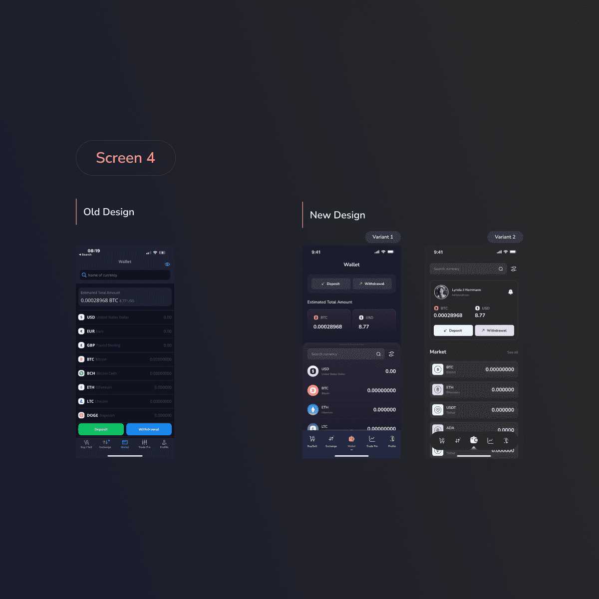
Redesigned Screens
1. Card Redesign
• Enhancements:
• Improved hierarchy and readability of cryptocurrency information by adjusting typography and spacing.
• Incorporated visual indicators, such as color-coded tags, to represent market trends (e.g., bullish or bearish) for quick user comprehension.
2. Dashboard Screen
• Improvements:
• Streamlined the presentation of key metrics and data visualizations to provide users with an at-a-glance overview of their portfolio and market status.
• Implemented interactive elements to allow users to customize their dashboard, enhancing personalization and engagement.
3. Transaction Screen
• Refinements:
• Simplified the transaction process by reducing the number of steps and providing clear, concise instructions.
• Added real-time validation and feedback mechanisms to assist users in completing transactions accurately and efficiently.
4. Profile Management Screen
• Updates:
• Redesigned the layout to make profile information easily accessible and editable.
• Incorporated security features, such as two-factor authentication settings, to enhance user trust and application security.
Outcome
The UI redesign of the cryptocurrency mobile application resulted in a modernized interface that aligns with current design standards and user expectations. The thoughtful selection of typeface, color palette, iconography, and grid system contributed to a cohesive and engaging user experience. The redesigned screens offer improved usability, readability, and aesthetic appeal, positioning the application to better serve its user base in the competitive cryptocurrency market.